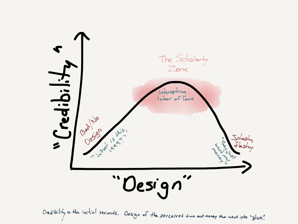
 So here’s a question: If you make your digital humanities project so that the product is a gorgeous website with swoopy interactive capabilities and lush soundscapes, will people engage with it on a deep scholarly level, or will they get stuck in the flash and glam?
This was a question that came up today at a DH workshop on campus, and it got me to thinking about a similar question that had come up at THATcamp in Denver last year — how much web design do you need before people will pay any attention to your site?
People make snap decisions about website credibility, and they do so largely unconsciously, so research suggests that if you make your site look nice, people will stay on it rather than move on to look for something “better.” This is what people at THATcamp were talking about last year — the need to have enough web design built into their DH projects that their projects will be taken seriously.
On the other end of the spectrum, if a site is TOO beautiful, I start thinking it’s likely to be trying to get money from me. All the money for the custom designing and maintenance has to come from somewhere, right? Likewise, I’m not at all used to seeing scholarly books come out with incredibly designed covers, glossy pages, and custom illustrations.
So maybe there’s some spot part way between “grungy” and “flashy” that would appear the most credible for scholarly DH work. The question is, where along that continuum is the sweet spot?